the wrecking co.
client name : the wrecking co..
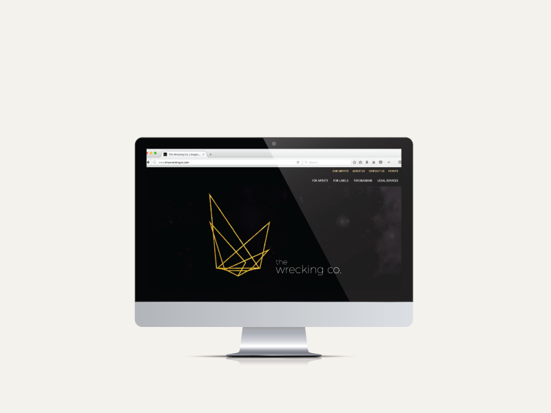
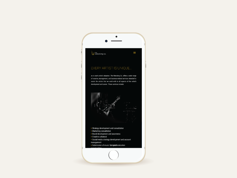
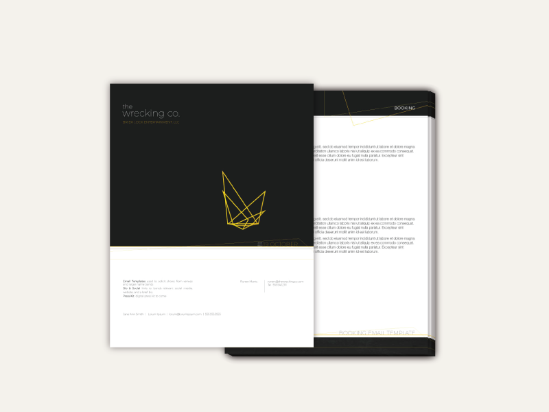
the wrecking co. was an artist development platform specializing in the dynamic growth of unsigned and underdeveloped artists.
the wrecking co. was an artist development platform specializing in the dynamic growth of unsigned and underdeveloped artists.
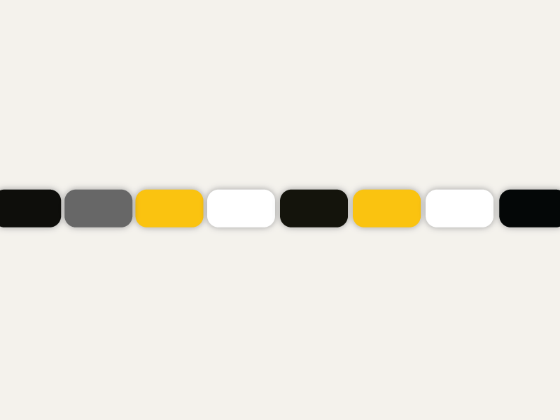
the goal was to create a set of brand standards that portrayed an atmosphere of innovation. we wanted the experience to feel natural and exciting like the user was being invited into an exclusive club that only other extraordinary artists were admitted to.
solutions.
website
branding
print design: posters, business cards
merch design
album art
website
branding
print design: posters, business cards
merch design
album art


Recent Comments