
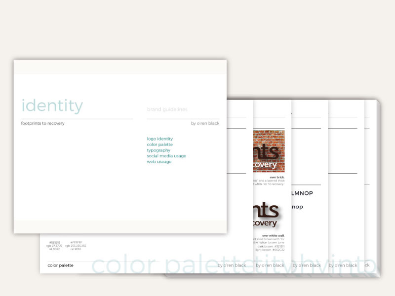
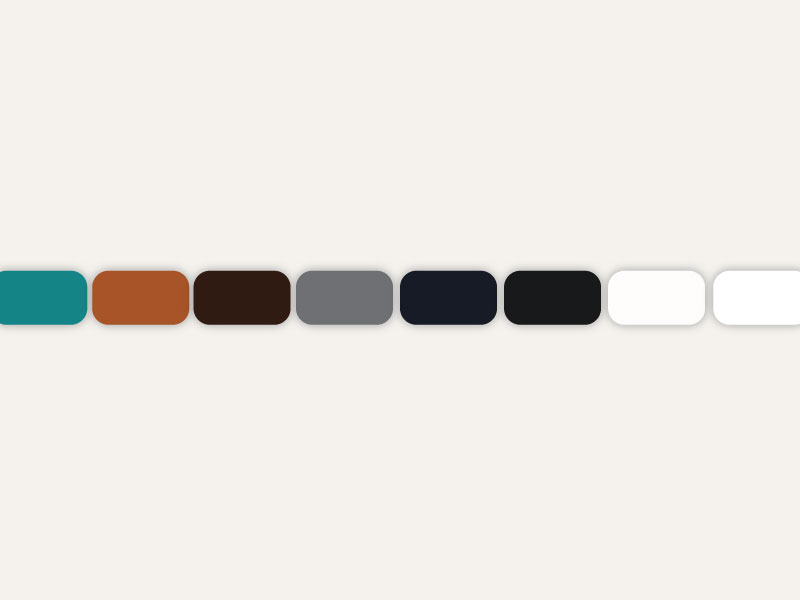
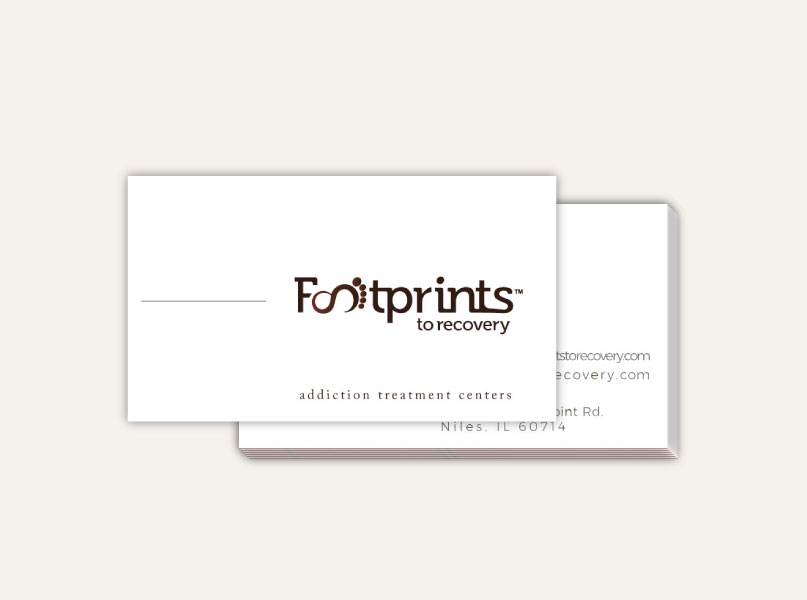
Footprints To Recovery
Footprints To Recovery is a drug and alcohol rehabilitation center with locations across the United States. They came to me to refine their logo and develop their brand standards. I laid out the foundation for a better and more cohesive brand strategy.
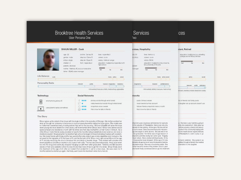
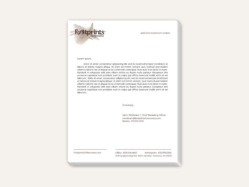
Footprint’s To Recovery had old and inconsistent branding. I took their old logo, refined it and applied rules to follow for cross-platform integration. I developed print collateral and their brand standard guide.

Recent Comments