Premiere Property Productions

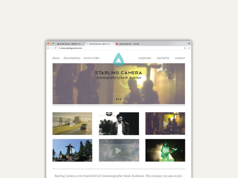
Premiere Property Productions is a boutique video editing and production company that specializes in commercial real estate. They work closely with properties to ensure their digital visual assets are showcasing the space in the best possible way.
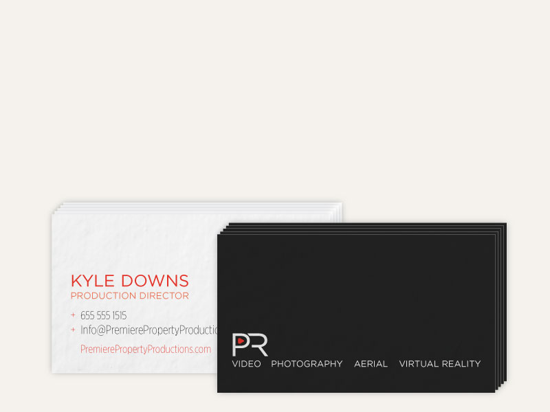
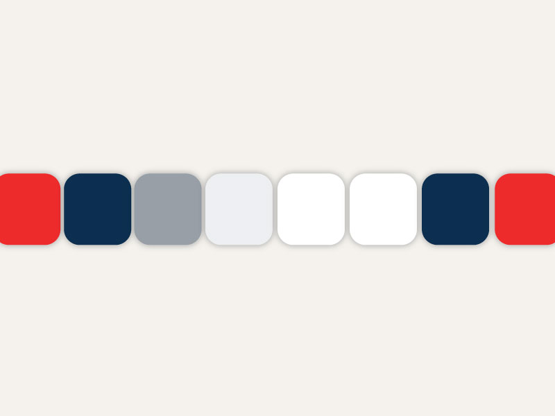
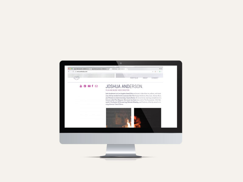
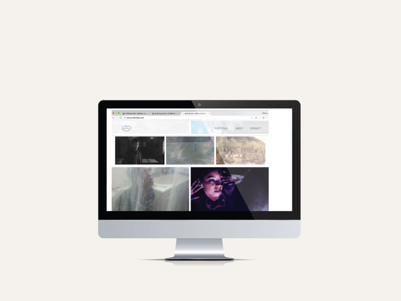
The challenge, to develop a brand and website that portrays PPP’s commitment to clean, sleek, and sophisticated video and photography for the upscale residential and commercial property.

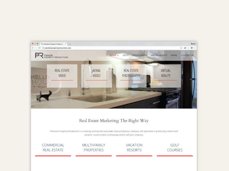
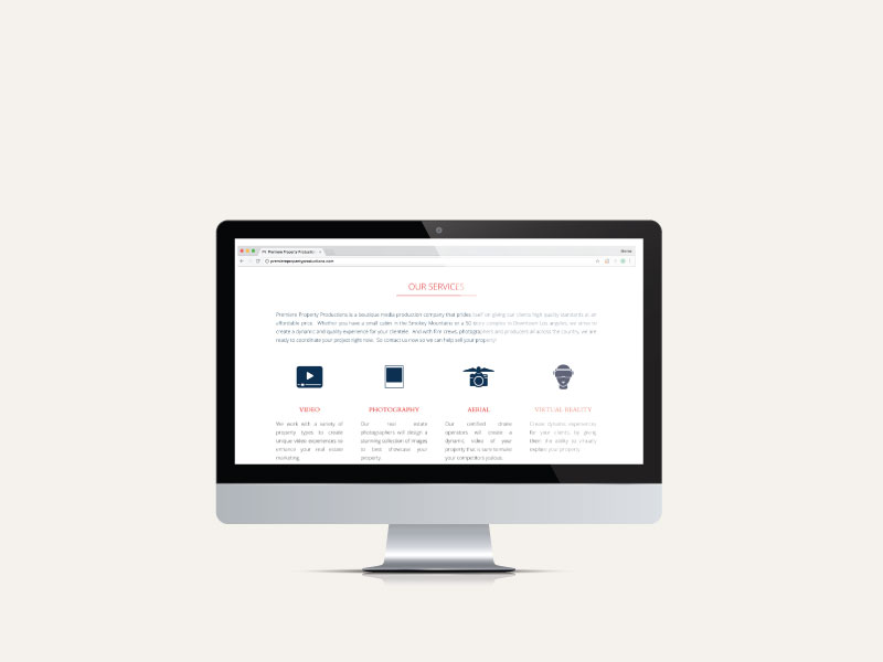
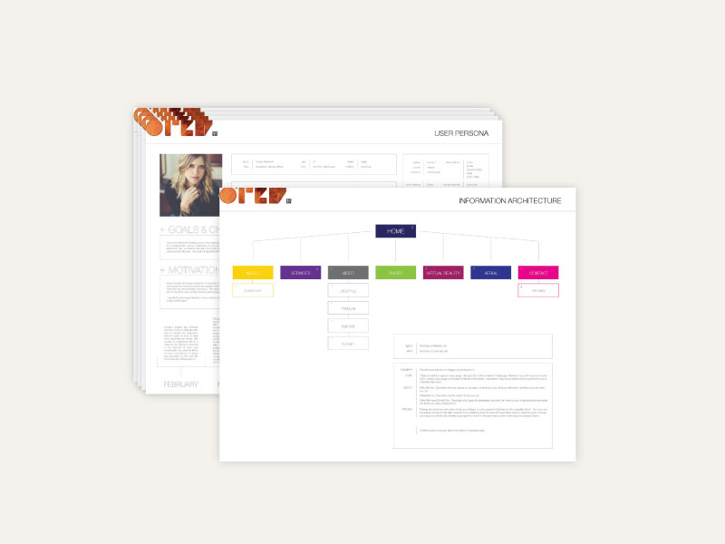
We took a long hard look at the market and then at the user, the demographics of the people doing the hiring, created a journey map and developed a strategy based on their wants, needs, and challenges in finding the right company. We spoke with them, we studied them and our plan was fully formulated of an understanding of who they were and what they needed. We took out all the clutter and focused on the essentials up front, why they were here in the first place. Our branding and web design focused on a clear, clean aesthetic that pointed to PPP’s dedication to showcasing the product details in a way that accentuates their beauty and elegance.

And Her Lips

AndHerLips is the production house of Hollywood Director Josh Anderson. They develop stories for film, are an editing house and produce and direct music videos and film narratives.
The challenge, to create a website and branding that captures the creativity, intrigue, and beauty of the work AndHerLips puts out (quite a grand task). Our strategy revolved around finding little nuggets of beauty scattered throughout the work, to curate a story arch that brings his imaginative way of seeing into a dynamic user experience.
Josh’s work has an incredibly vibrant mystique. After laying out a full competitive landscape of what directors and production houses are doing, we looked at how the target audience digests information, navigates through video, their habits, and we developed an experience that captivate and plays at an almost child-like sense of wonder. We curated a story that pulls the user through. The branding plays with this same conceptual ideology that Josh adheres to in his work. We chose a muted yet vibrant color pallet that foreshadows the work. The logo, a play off the ideas of land, water, and sky creating a mountain scape in the form of one of our most sensitive assets.

Starling Camera

Starling Camera is the production company developed by Sarah Anderson, a cinematographer, gaffer, and basically one of the greatest people ever.
The challenge, to create branding and a website that showcased her work, style, and more importantly, her philosophy and activism. We needed to help garner clients who also wanted to use film as a medium to inflict positive change. Sarah is a big advocate for social justice, with a provocative and stimulating theme to the way she shoots and sees the world. We developed a clean approach with small, but bold, understatements allowing the work and Sarah to do the talking.

Words are power. We wanted to steer Sarah towards an approach that allows her to talk about the work and why she chooses a project and what the impact of that project is. We developed a very angular, bold, clean logo that represents an openness to listen and creates the feeling of unity. It is always an open dialogue. We paired this with a soft color pallet, playing with the idea of light and shadow, the benchmark of the nature of film and photography. Sarah is an avid ocean lover, she shoots underwater for fun and we wanted to incorporate this love into the development of her brand, using a pallet that is reflective of the sky and the sea.