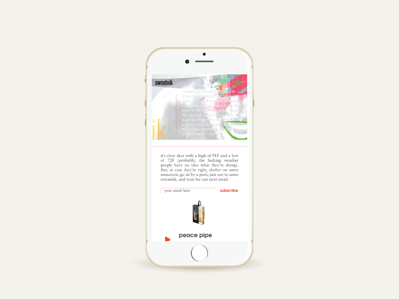
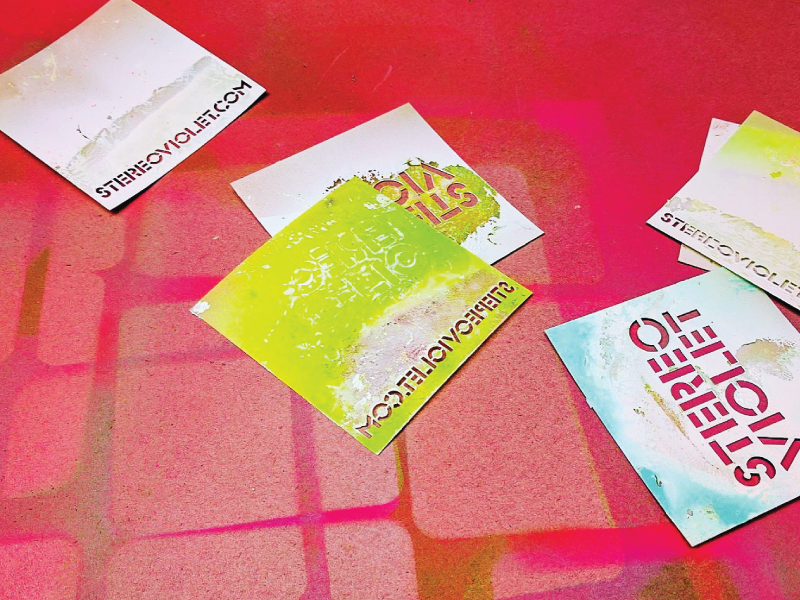
sweatnik

Sweatnik is the music duo of Chicago legends Kevin Ford and Jonathan Marks.
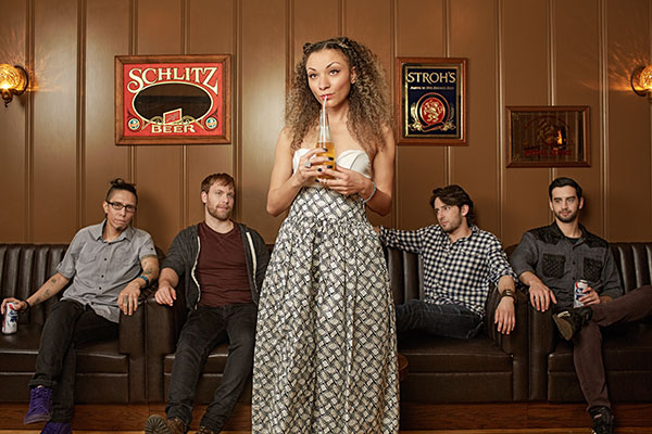
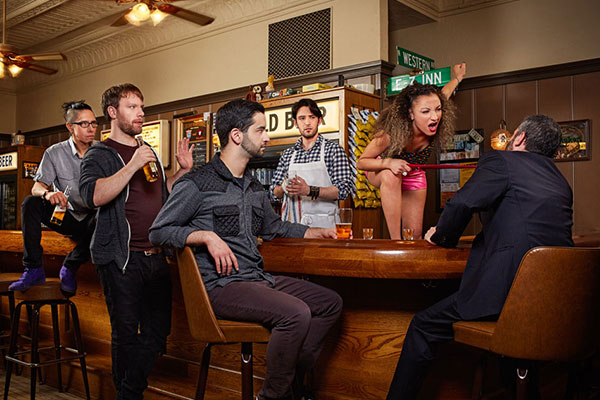
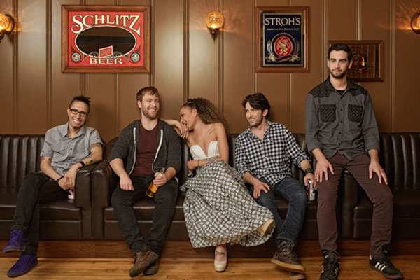
The challenge, to create a website and brand that captures the creativity, and humor of this Tucan Sounds group.
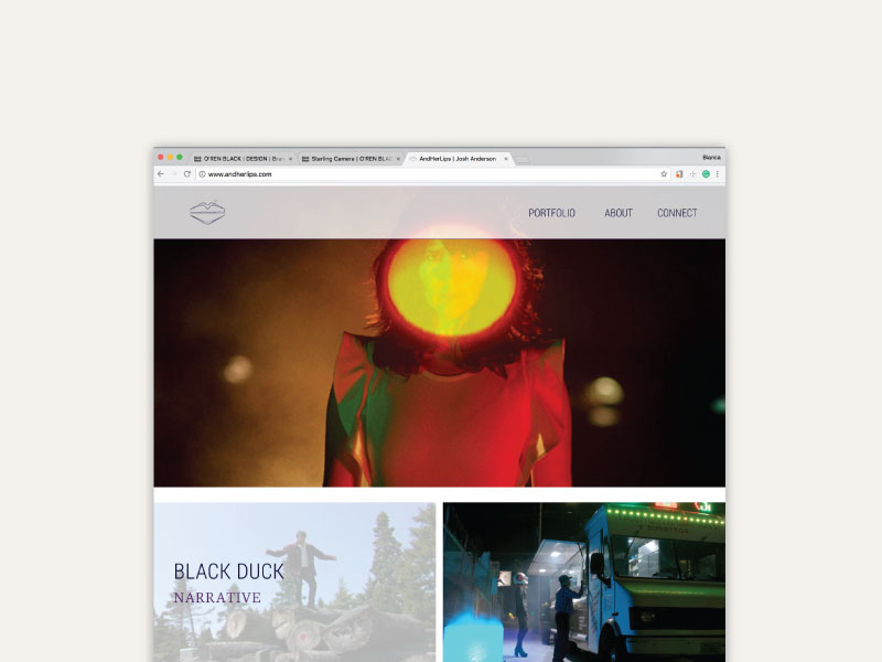
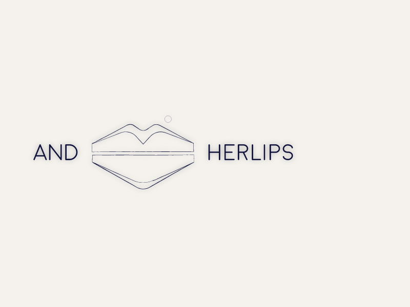
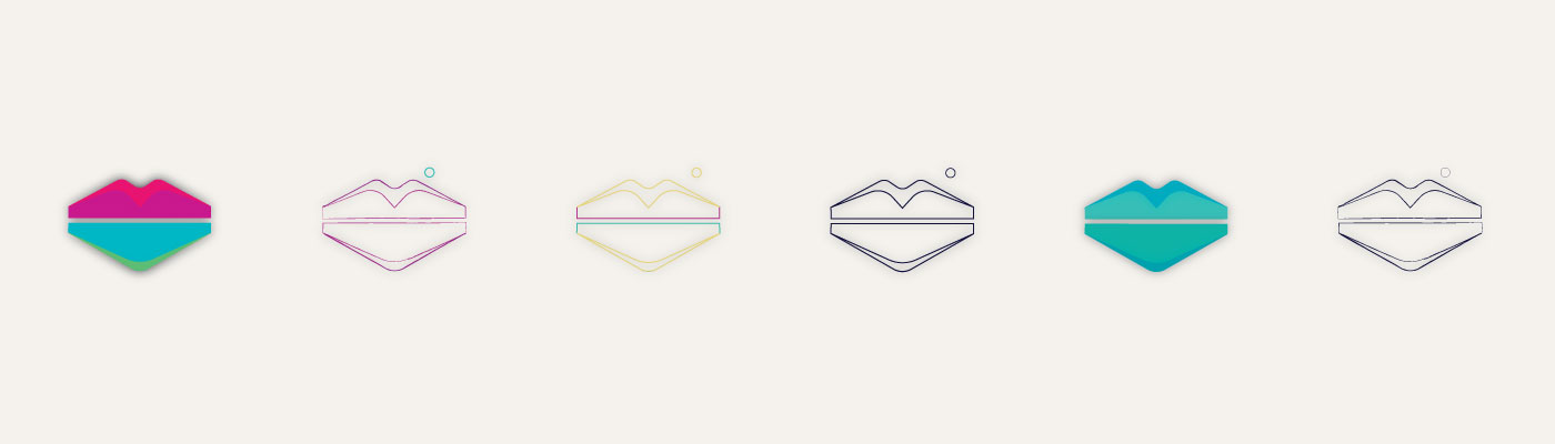
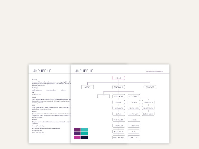
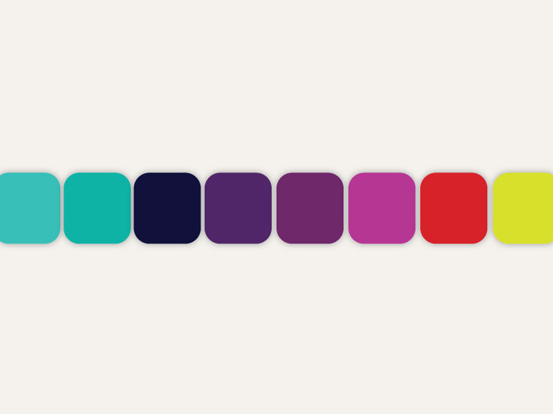
Josh’s work has an incredibly vibrant mystique. After laying out a full competitive landscape of what directors and production houses are doing, we looked at how the target audience digests information, navigates through video, their habits, and we developed an experience that captivate and plays at an almost child-like sense of wonder. We curated a story that pulls the user through. The branding plays with this same conceptual ideology that Josh adheres to in his work. We chose a muted yet vibrant color pallet that foreshadows the work. The logo, a play off the ideas of land, water, and sky creating a mountain scape in the form of one of our most sensitive assets.

tbtw

the bellow + the whale is the musical and artistic collaboration of Bianca Goyette and Julia Lee Norris. At its core, it is a celebration of storytelling and the diverse media that humans have employed to engage in this critical cultural practice. Our work ranges in approach and context, utilizing mixed media to document tiny shared moments. We start creative conversations between people of diverse backgrounds, viewpoints, and tenants.
We produce performances and installations of varying scales, intended for display in a range of contexts and spaces; museums, galleries, large capacity music venues, small dives, and the streets. We develop interactive experiences across these and digital platforms in hopes of bringing this form of storytelling to a larger audience. Our digital presence (website, Instagram, facebook, twitter channels) is a medium in which to share our story on a global scale using photography, mixed media collages, animation, video, and creative writing. The interactive nature of social media allows our audience to become a part of our ever-evolving narrative; which grants us a community to draw inspiration from. Our digital presence exists as an extension to our physical performances, reinforcing the links between multiple forms of reality.

the wrecking co.

the wrecking co.

client name : the wrecking co..
the wrecking co. was an artist development platform specializing in the dynamic growth of unsigned and underdeveloped artists.

the goal was to create a set of brand standards that portrayed an atmosphere of innovation. we wanted the experience to feel natural and exciting like the user was being invited into an exclusive club that only other extraordinary artists were admitted to.

solutions.
website
branding
print design: posters, business cards
merch design
album art

Hoover Speech Therapy

client name : hoover speech therapy.

Laura Hoover is a Washington, DC-based speech pathologist specializing in early learning detection in children.

The goal was to create a brand that communicated a warm, inviting, child-friendly environment targeted towards mothers of young children and learning facilities that could provide referrals.

solutions.
website
branding
print design: business cards
Laura Hoover’s practice relies heavily on referrals from other clients and professionals in the childcare/education industry. She is a warm, kind, and patient person and we wanted to show that with her branding. She wanted the flexibility to expand in the future, so we created a brand that can grow as her practice does.

stereoviolet

stereoviolet

client name : stereoviolet.
stereoviolet was a Chicago-based alternative rock band. The group was an energetic visual experience that was carefully crafted and developed by o’ren black.
The challenge, to create a brand that could evolve with the music and play into the energy and excitement of the visual aesthetic of the music and its creators. The strategy revolved around playing with color and light, developing a larger than life visual story.
solutions.
website
branding
print design: posters, business cards
merch design
album art
stereoViolet’s music fed heavily off of the bands’ personality and vice versa. The band was a mesh up of hard rock, alternative, and soul music with dark gritty undertones and sweet thoughtful highlights. We wanted the aesthetic to be colorful and full of life, to take the viewer into a world with grit, but that was full of heart.

We wanted the branding to evolve throughout the seasons, to grow with the band. So each tour season had a different aesthetic but still tied into the overall theme of the brand.

Hello world!

Welcome to WordPress. This is your first post. Edit or delete it, then start writing!