
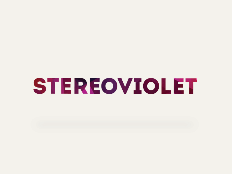
stereoviolet
client name : stereoviolet.
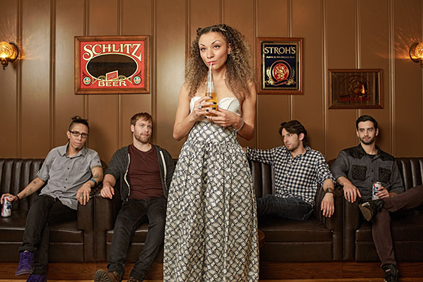
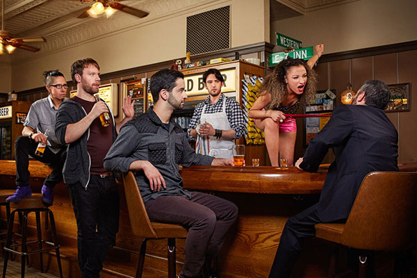
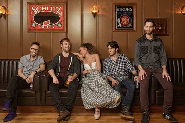
stereoviolet was a Chicago-based alternative rock band. The group was an energetic visual experience that was carefully crafted and developed by o’ren black.
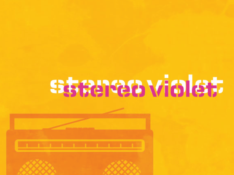
The challenge, to create a brand that could evolve with the music and play into the energy and excitement of the visual aesthetic of the music and its creators. The strategy revolved around playing with color and light, developing a larger than life visual story.
stereoviolet was a Chicago-based alternative rock band. The group was an energetic visual experience that was carefully crafted and developed by o’ren black.
The challenge, to create a brand that could evolve with the music and play into the energy and excitement of the visual aesthetic of the music and its creators. The strategy revolved around playing with color and light, developing a larger than life visual story.
solutions.
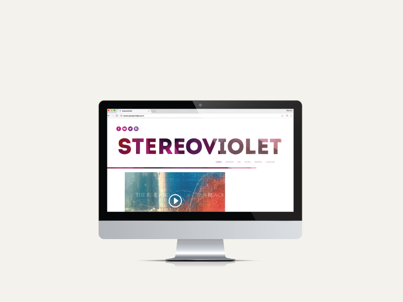
website
branding
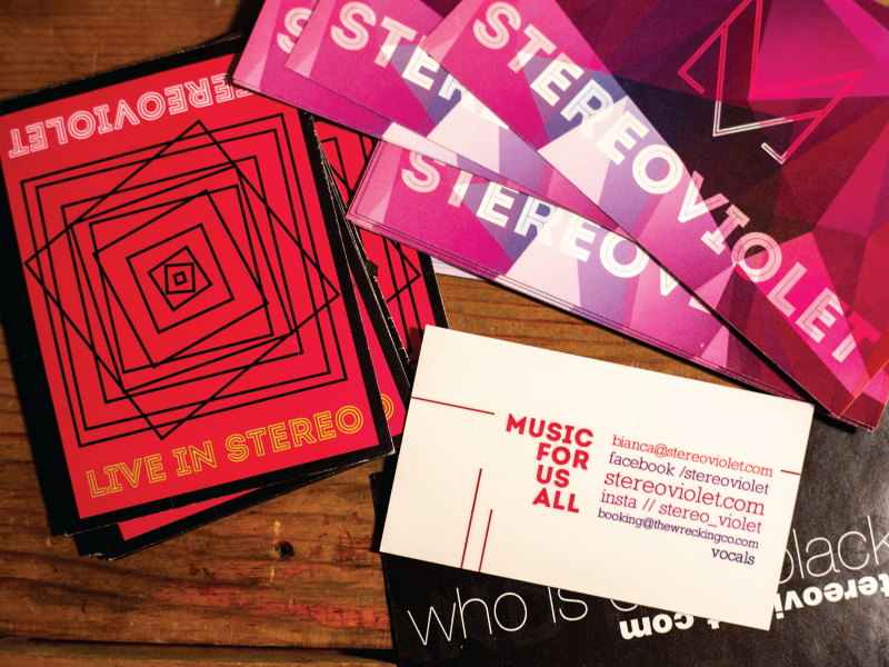
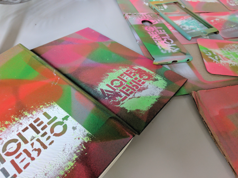
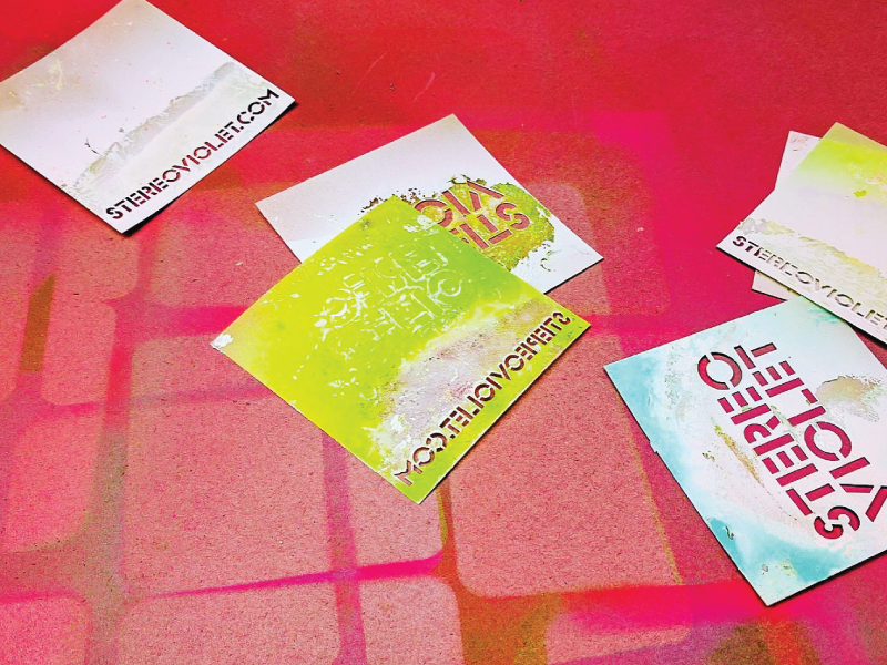
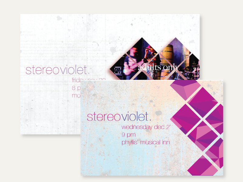
print design: posters, business cards
merch design
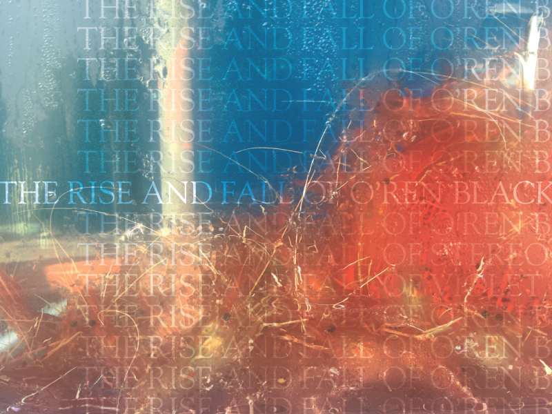
album art
website
branding
print design: posters, business cards
merch design
album art
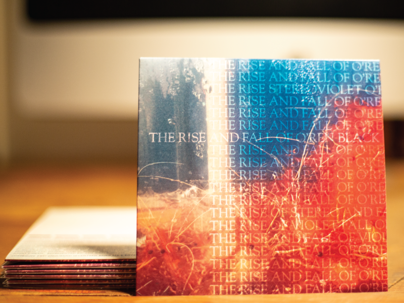
stereoViolet’s music fed heavily off of the bands’ personality and vice versa. The band was a mesh up of hard rock, alternative, and soul music with dark gritty undertones and sweet thoughtful highlights. We wanted the aesthetic to be colorful and full of life, to take the viewer into a world with grit, but that was full of heart.
We wanted the branding to evolve throughout the seasons, to grow with the band. So each tour season had a different aesthetic but still tied into the overall theme of the brand.
Recent Comments